Podio (Citrix)
Making overview and detail feel like one place
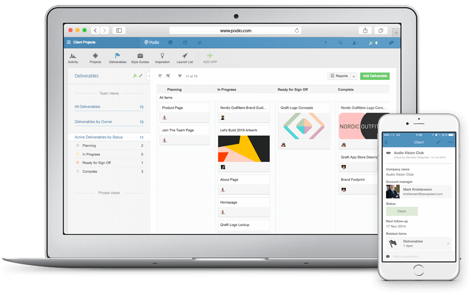
Podio lets teams build their own workflows, but new users had to understand organisations, workspaces, apps, and items before they could get much done. Product data showed that they were creating fewer items, while interviews exposed a break between overview screens and the item page where the work happened.
Role & Strategy
I led the Content First redesign of the Podio item page. We replaced a navigation-heavy layout with a paper metaphor: the item sat on a white page, comments stayed alongside it, and users could edit in place. I interviewed users and built high-fidelity prototypes to test the move from an overview into the item and back again.
Background and challenges
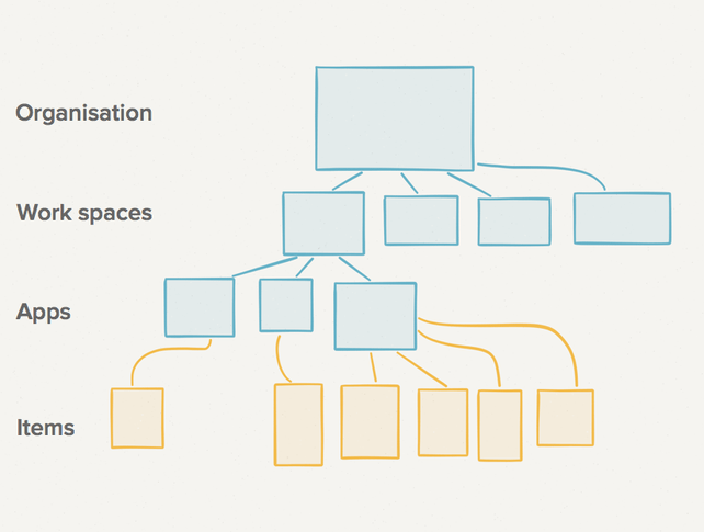
Different industries used different parts of Podio. Advertising agencies relied on the activity stream, while recruitment companies focused on tasks. Whatever their workflow, new users first had to understand Podio’s structure: items inside apps, apps inside workspaces, and workspaces inside organisations.
An item could be a meeting, contact, project, sales lead, or another kind of record defined by the team. Product data showed that new users were creating fewer of them.
So how could we make people understand Podio’s core values and create more items?
Why users were creating fewer items
- Creating and editing an item sat deep in Podio’s hierarchy.
- Opening an item from an activity stream or app layout triggered a full page load. Once on the item page, people had no clear route back to the overview they came from.
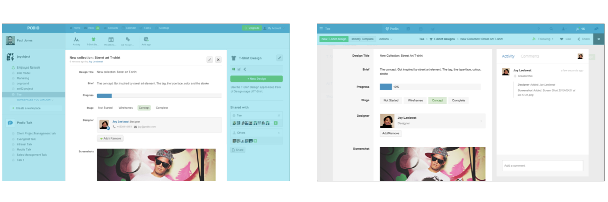
- Navigation occupied 40% of the item page, leaving the content with little visual priority.
- Podio’s structure and workflows were abstract, so the interface had to explain relationships that a task list or calendar could show more directly.
The process
We studied two parts of the product: overviews and item details. The activity stream, inbox, and app layout showed work at a glance. The item page was where people added content, changed a status, commented, or assigned a task. Product data showed frequent movement between the two. We called the design principle for that handoff Content First: people should be able to move into the work without losing the overview they came from.
Old solution
Our first solution was the Slidy Panel. Clicking a row in the app layout opened its details from the right, avoiding a full page load. It preserved the overview, but created new problems:
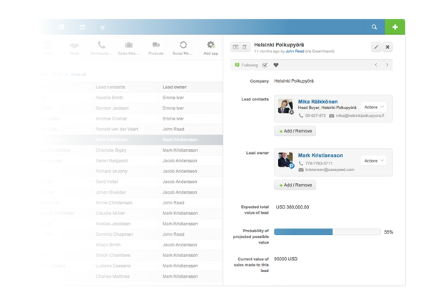
- The panel appeared only in the app layout, so the interaction did not carry across Podio.
- It was read-only. Editing or commenting still required a trip to the item page.
- The narrow column crowded the content, while the repeated sliding motion made the page feel unsettled.
The solution
Paper-Based Metaphor
We removed the Slidy Panel and designed one overview-to-detail pattern that could work across Podio. A workshop in the shipyard district outside Copenhagen led us to the paper metaphor. The item became the visual focus, with navigation and controls taking a supporting role.
Each item is represented as a piece of paper.
Paper gave an abstract item a familiar shape. The item appeared as a white sheet on a soft grey surface, with comments attached along its right edge.
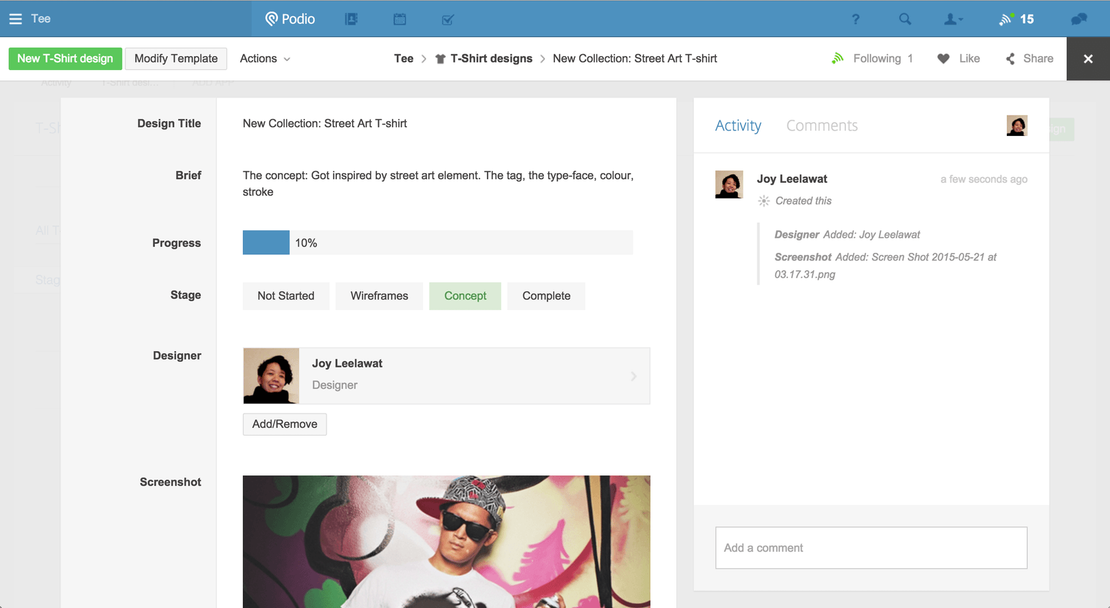
Good Old Breadcrumb
We tidied up navigation from real usage data. We removed app-level navigation where we saw little cross-app hopping, and promoted breadcrumbs as the primary wayfinding pattern: compact, explicit, and text-forward. We used fewer icons and relied on clear labels.
No Edit Mode. It’s paper. Just write as you write on paper.
We wanted reading and writing to happen in the same place, with as little interface chrome as possible. We removed the separate Edit Mode and let people work directly on the item page, much like a word processor.
Showing the move from overview to item
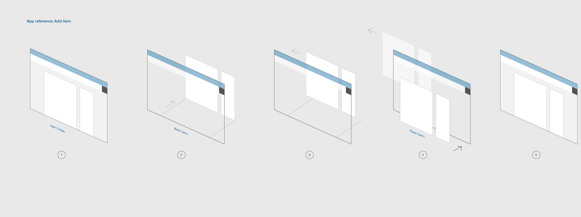
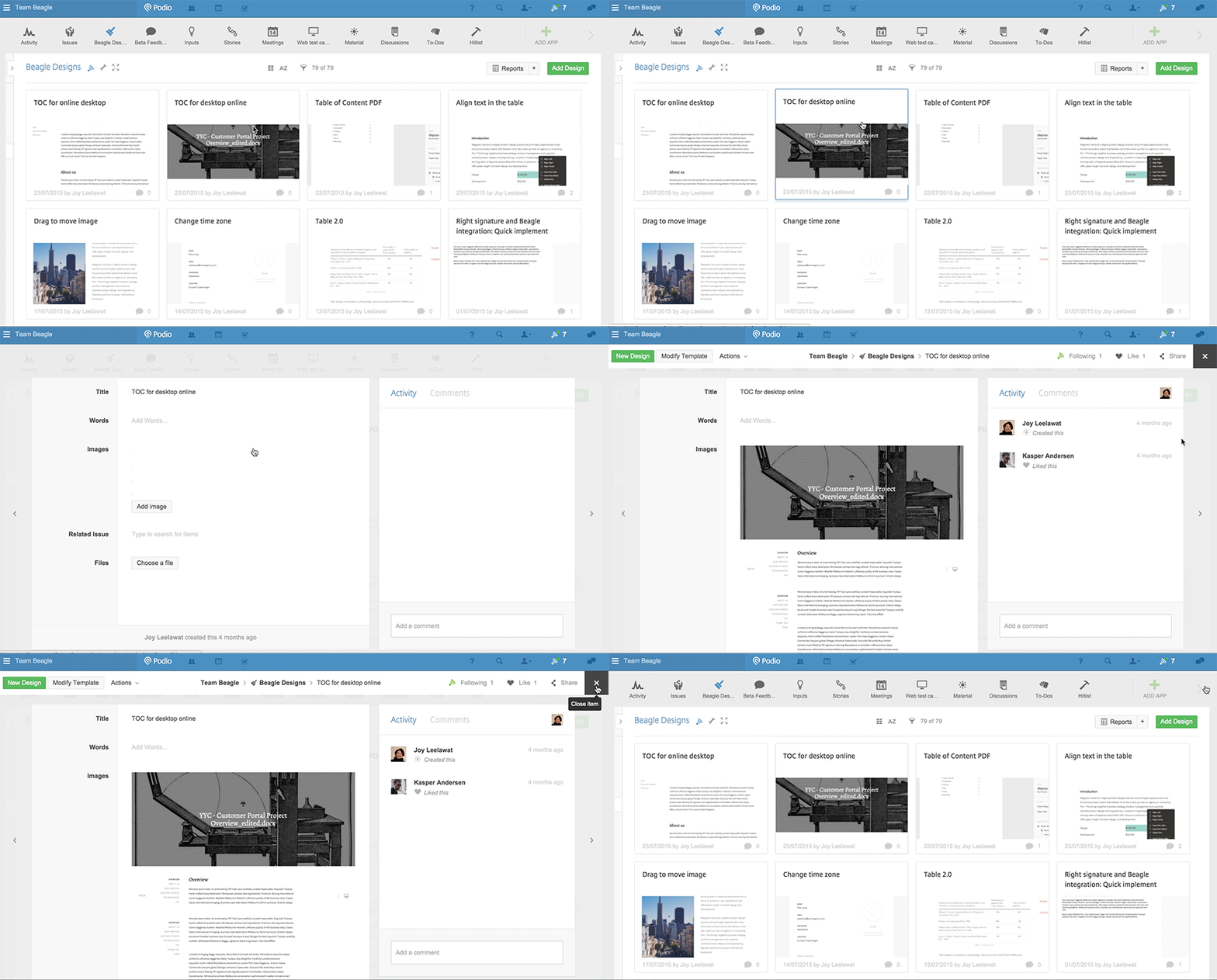
The transition had to show where an item came from and where it returned. Across the app layout, activity stream, and inbox, the item behaved like a sheet of paper lifting from a desk. We worked with engineering to load it over the current view so people stayed anchored to their starting point. The animation below shows a new item opening over an app layout.
The paper metaphor also helped explain links between items, one of Podio’s more advanced features. I studied arrangements of stacked paper and used them as the basis for the relationship diagrams.